Bovine Heart Illustration
Medium: Prismacolour pencil crayons
Client: Personal project
Purpose: This project was a personal study in hyperrealism, aimed at accurately capturing the intricate visual details of a live organ. It served as an exercise in improving my observational precision and deepening my understanding of the unique textures, tones, and surface variations found in different organ tissues. By focusing on realism, I was able to explore how light interacts with moist, vascular, and fibrous structures, ultimately enhancing my ability to depict biological forms with anatomical accuracy and lifelike clarity.
Process Work
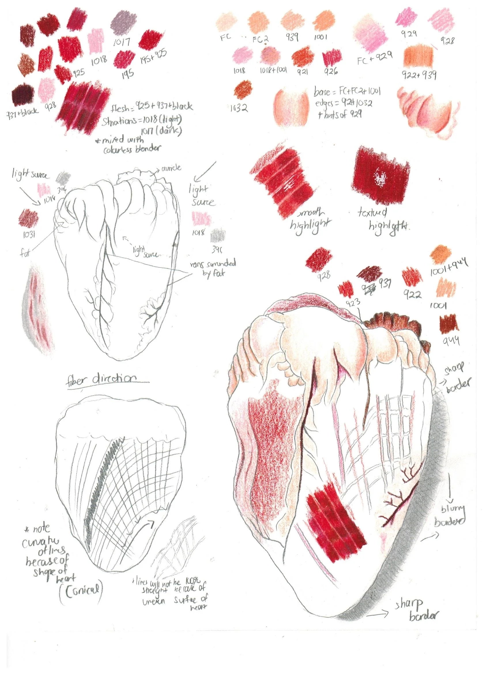
In developing this heart study, I began by creating preliminary sketches to explore the overall form, anatomical accuracy, and surface detail of the organ. I paid close attention to the proportions of the chambers and vessels, using reference images and anatomical texts to ensure precision. Alongside these sketches, I developed a series of color swatches to build a cohesive palette that would reflect the natural hues of cardiac tissue: warm reds, purples, and subtle browns, balanced with cooler tones for contrast.
To bring a sense of realism and depth to the final piece, I carefully established a consistent light source early in the process. This helped me determine how light would interact with the organ’s moist, muscular surface. I mapped out areas for specular highlights where the tissue would appear glossy and wet, and used softer, diffused highlights to indicate curved or fibrous areas with less sheen. This approach allowed me to create a more tactile and dimensional rendering while training my eye to interpret how light behaves across different textures of living tissue.